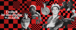
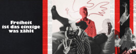
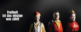
A German revolution in six short acts: A small group of insurrectionists have already completed the official founding of the New Reich. Now all that remains is to finally overthrow the German government by force. “Freiheit ist das Einzigste was zählt” is a frantic show that thrives from its wild, theatrical vibe. Rare elements of calm are provided by intersecting title screens that give context to the frenzied action and dialogues.
We designed these silent movie-like screens, as well as the opening and end credits. Initially we were asked to only design a banner image for the online representation of the project. After a wide visual research, this task turned into a larger design output, with the graphic layer of the series gaining a larger impact on the storytelling style. In the end, the stylized intertitle screens were supported by classic “arte”-style subtitles in cursive. Ironically, the only output that did not end up in the final delivery was the collaged banner image that we were originally tasked with.


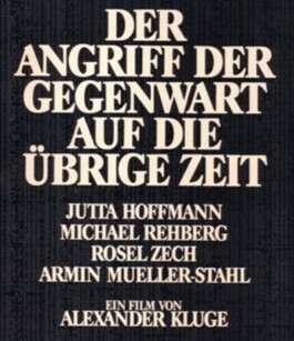
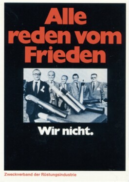
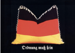
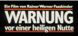
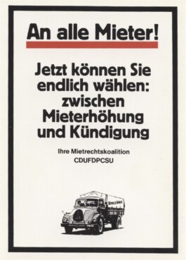
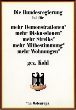
For the design we took inspiration from multiple angles. We had a wide approach to the topic in our visual research: diving into anti-government facebook groups and into archives of the German yellow press. We also quickly discovered that visual artists in fine arts and in cinema had also adopted a similar aesthetic, using typefaces (both in print and in title design), that assosiations of covers of both “BILD” and “Spiegel”. Some of our early designs were inspired by the use of typography in Klaus Staeck’s posters and films of Alexander Kluge.